Times like these, the old-school print copy editor in me gets testy.
In an age where major media outlets preach the gospel of mobile first and responsive design, orphans and bad breaks in headlines abound. I’ve heard production editors reason that because there are just so many sizes of screens to account for — desktop and laptop monitors, iPhones, iPads, iPad minis, the Android contingent, etc. — it’s not worth sweating the presentation.
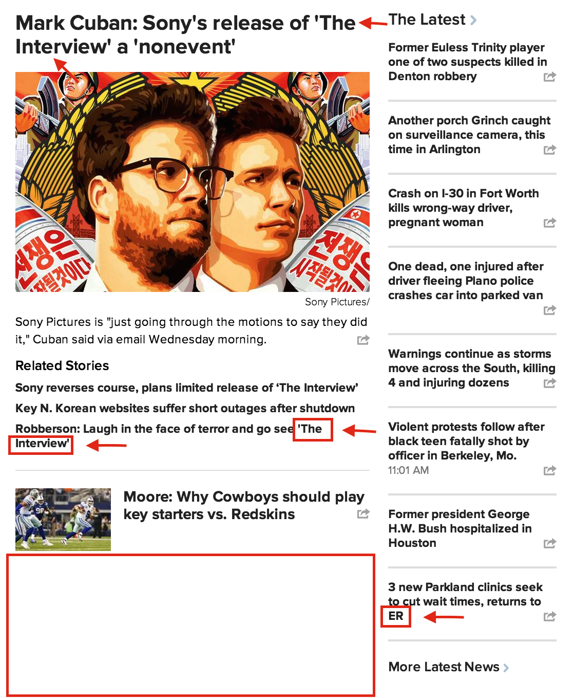
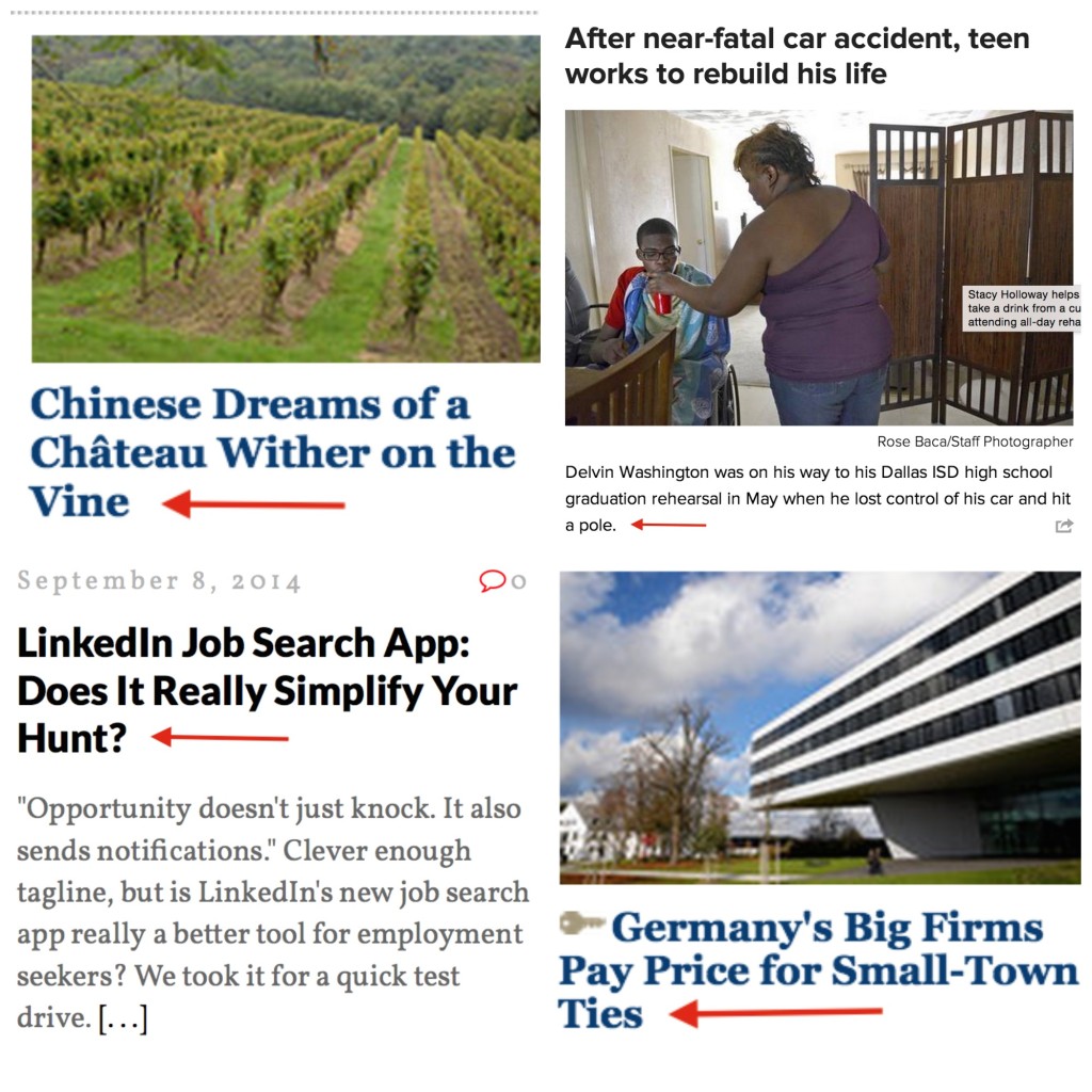
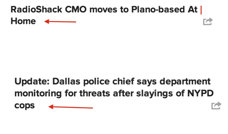
Here are some examples of this problem in the wild:
Mobile first does not mean mobile only. Mobile traffic may be outpacing desktop traffic, but a substantial percentage of readers still get their news on a larger-display screen. What are they, chopped liver? Don’t bite the fusty hand that feeds you. Don’t abandon the principles you learned in J school.
Second, many content management systems now include the ability to preview across devices. All it takes is a competent developer to set up such CMS tools properly and a competent editor to use them. Don’t have the resources for such tools? Then count your characters manually and create (and enforce) rules for producers.
[callout template=”Aside”]
Samantha’s Incomplete List Of Production No-Nos
The Worst Offenses
Breaking a proper noun at the line:
Ex: The weather outside is frightful, but Dolly
Parton’s entertainment style is delightful
Orphans:
Ex: It’s lovely weather for
a sleigh ride together with
you
Vast swaths of white space created by badly managed copy (see image above)
Less Egregious But Still Irritating
Breaking a prepositional phrase or verb phrase at the line:
Ex: Police: It’s beginning to
look a lot like Christmas[/callout].
UPDATE: A talented and thoughtful former colleague from The Dallas Morning News, John Hancock, added some excellent insight into the considerations designers grapple with regarding responsive design. When I can figure out why embeds aren’t working in this post, I’ll add the tweet here. In the meantime, here you go.


RECENT COMMENTS